The Logo chapter is quite long, so it is divided into two chapters.
App Logo
actually App Logo You can use the brand logo mentioned in the previous chapter and add a rectangular border. It can be done in a few steps using Figma 😂, but if you really don’t want to use Figma, you can also use Midjourney generate.
Take a look at the apps on your phone and think about the app logo. Prompt How should it be written?
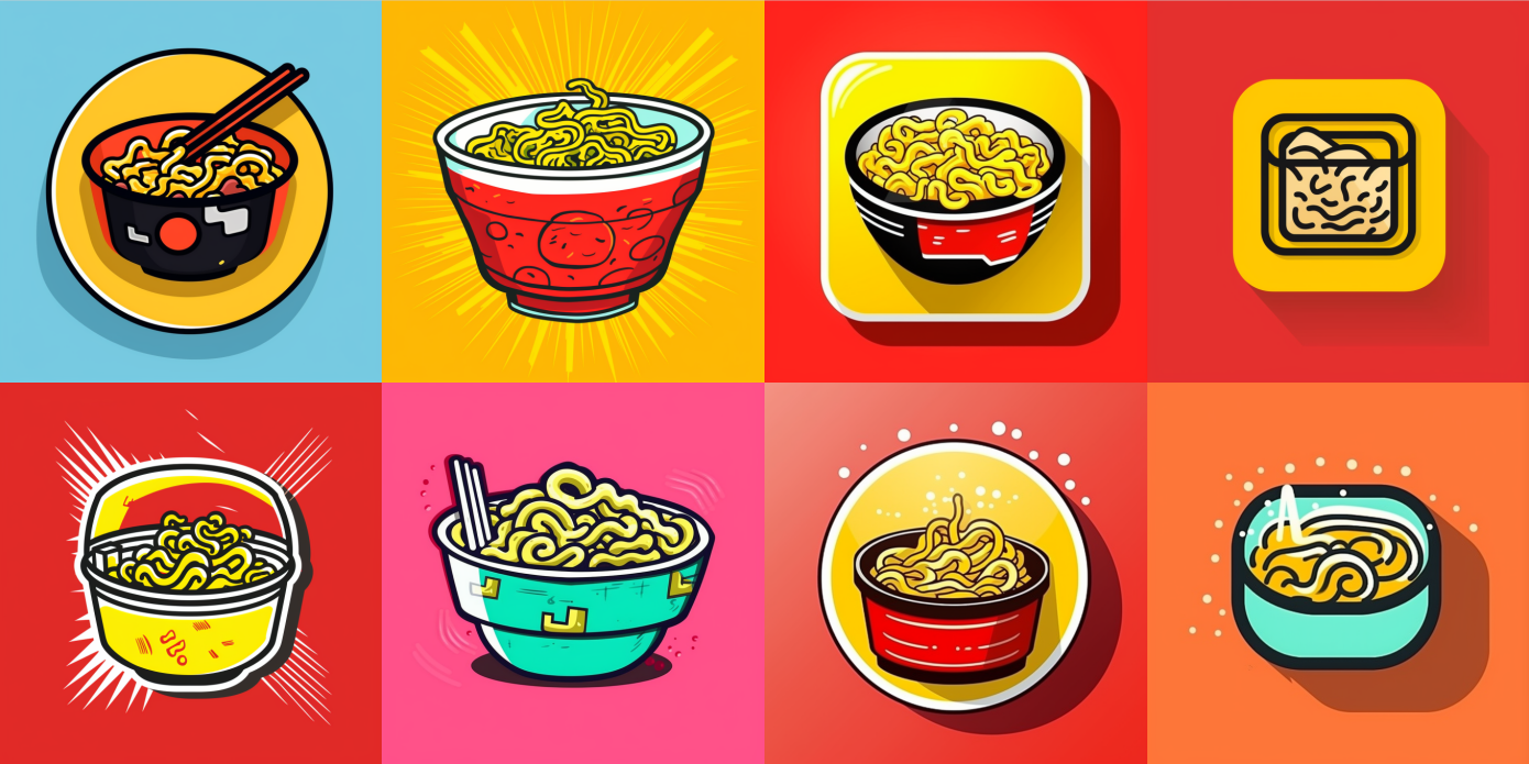
I used the example in the previous chapter to write two prompts, and the output is as follows:
The key is:
- Logo type: mobile app logo
- Logo Graphic Description:
- iOS ones are all rounded rectangles: squared with round edges
- Logo Graphic description, such as an icon for a Instant Noodles company
3. Style: Continue using the method mentioned in the previous chapter. I added a pop art
squared with round edges mobile app logo, an icon for a Instant Noodles company, pop art
I also found that adding an icon for before the logo graphic description makes the generated logo more in line with expectations. The one on the right has an icon for added, while the one on the left does not:

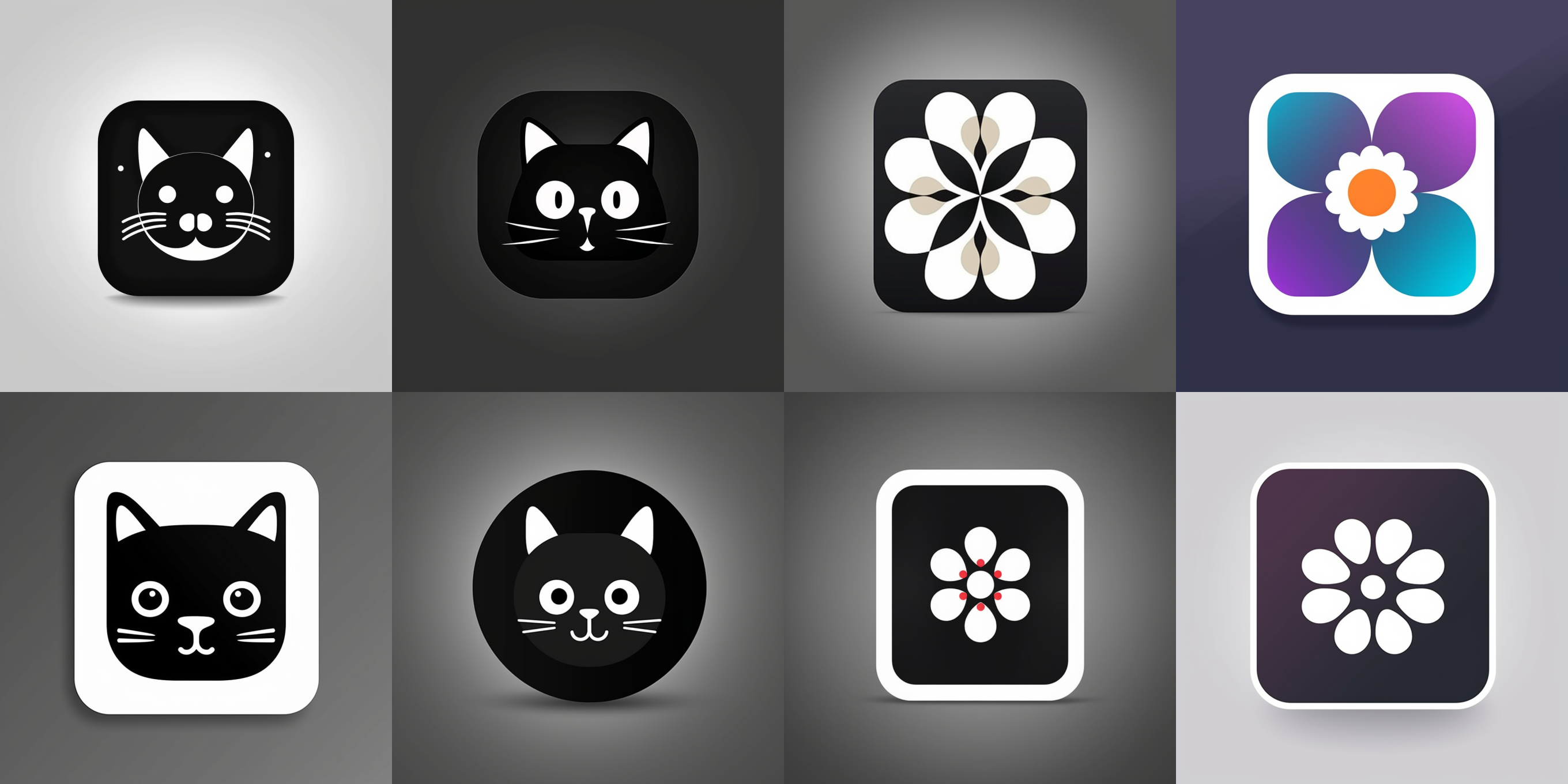
In addition, the logo pattern is Graphic, Lettermark and Geometric, which will be more in line with expectations:

Tip 5: Adding Style – Artist
The previous chapter introduced how to add art movements to make the generated images more special. This chapter will teach you another method, which is to add the names of artists. First of all, it should be noted that Midjourney supports most art movements, but the number of artists supported is relatively small. After the unremitting efforts of netizens, as of March 31, V4 has more than 2,000 known supported artists, and V5 has more than 100. Among the logo designers on the list, there are only Paul Rand and Saul Bass. Paul is the designer of the IBM, EF, and NeXT logos, and Saul is the designer of the United Airlines and AT&T logos. The method of use is very simple, just add by Paul Rand at the end of the prompt:
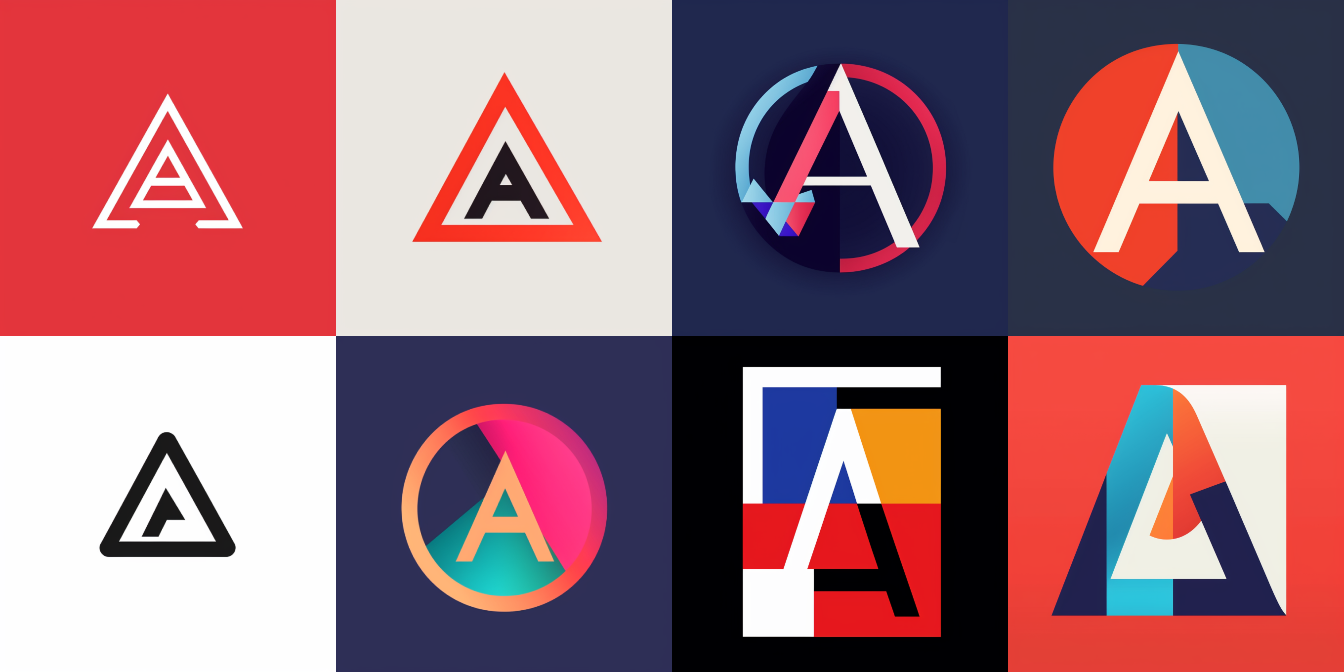
letter A logo, lettermark, typography, vector simple, by Paul Rand
Of course, it doesn’t mean that you can only add logo designers. It’s also interesting to add the names of designers who have never designed a logo. For example, the four pictures on the right are from Piet Cornelies Mondrian. The third logo has the flavor of Composition II in Red, Blue, and Yellow. The four pictures on the left are from Paul. The second one has a red frame and a black A, which has the flavor of his classic glasses logo. I like it very much:

Finally, please note that adding an artist name may result in the following situations:
- The styles of many long images are very similar: This is because some artists have very strong signature styles, such as Piet Mondrian, whom I like very much. If you use his name, you will find that many of the images generated may be in the style of Composition II in Red, Blue, and Yellow.
- The generated image does not look like the style of the artist: I tested it myself and found two possibilities. One is that the model has not learned the works of this artist (especially new artists, which I feel are generally not included). The other possibility is that some words in your prompt conflict with the style of the artist, such as using Leonardo da Vinci, but the subject is a Japanese 2D girl.
Badge Logo
The school emblem is a typical badge logo. It is also very simple to use. You just need to adjust the logo type to emblem. In addition, the style that goes well with the badge is Vintage. After adding both, the prompt is like this:
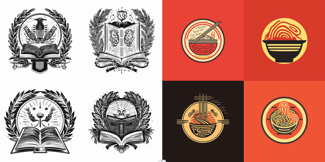
emblem for an Instant Noodles company, vintage, simple minimal
The four on the right have the word "vintage" added to them. They look very retro, don't they? I like them very much:

Tip 6: Use the no parameter to remove unwanted elements
In the case of badge logos, you should have also seen monochrome badges, such as school badges. But Midjourney has a habit of tending to generate complex content and monochrome content. You can add words such as color, background, etc. in the prompt to make it simple.
Another trick is to use the no parameter. For example, I want to make a monochrome school badge with a book as the main body. At the same time, because Midjourney is not very good at text, I also want to remove the text. Below is my prompt. I added no realistic color (no color) text (words) at the end.
emblem for a university with large book, vintage --no realistic color text
Then I added no text to the prompt of the Instant Noodles company above, and the two sets of pictures generated were as follows (Finally, it should be noted that when the no parameter is used in the logo, no text sometimes fails, but if you remove it - directly enter no text, it will take effect. It’s very mysterious and probably a bug):
