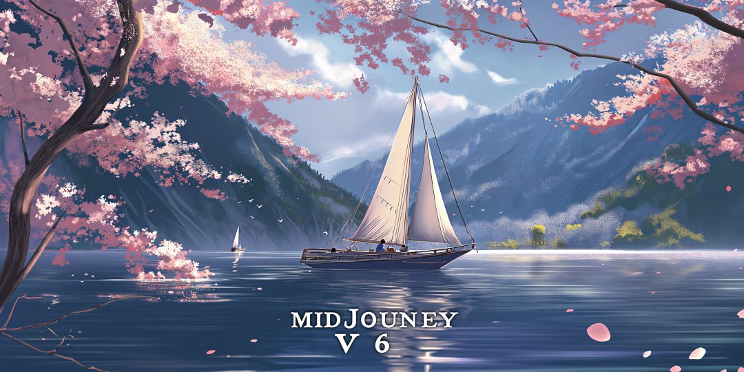
Here are seven keysSkillThe program is designed to help you combine text and images to create impressive works of art.
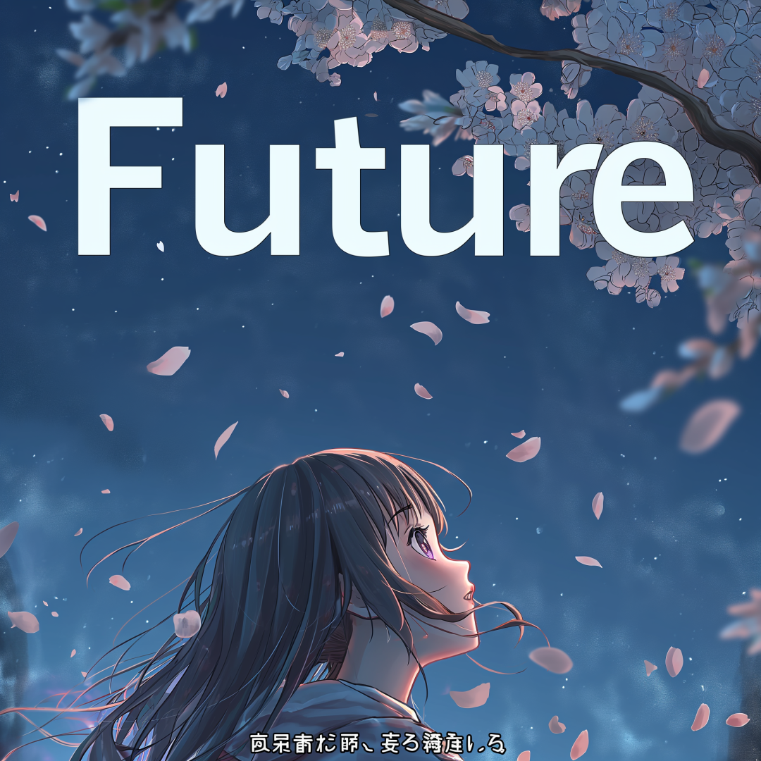
When you want to generate specific text in an image, put it in quotes. For example, let's say you want to present the word Future on an anime-style movie poster.
The correct way to do this is to put the word in quotation marks, e.g., "Future." This small change can significantly improve the accuracy and effectiveness of the text.
The right side is without quotes, while the left side is with the effect of quotes.
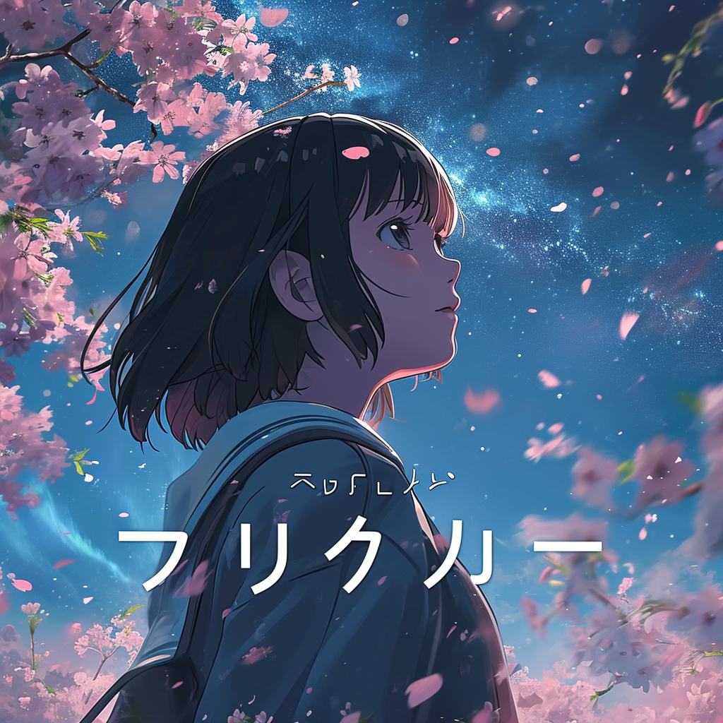
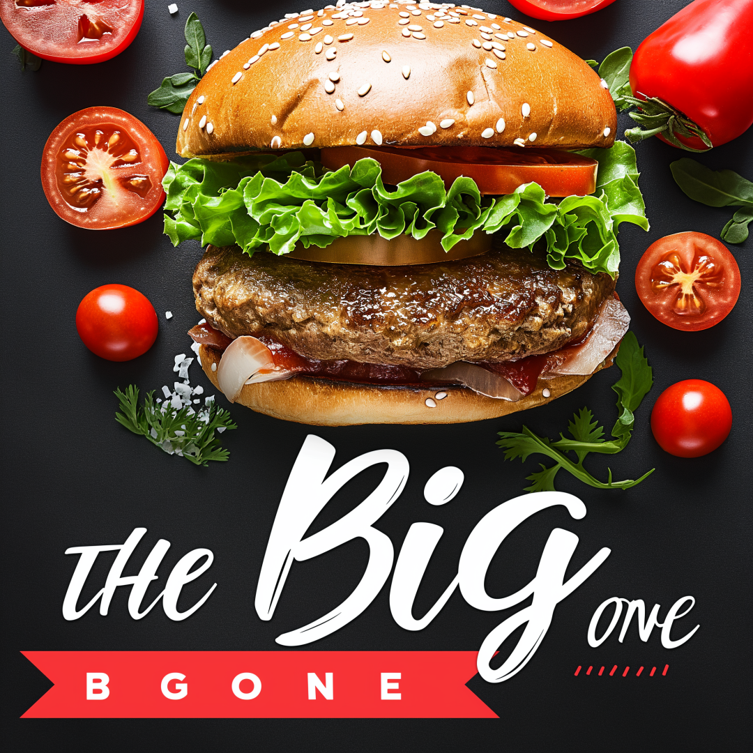
Adding descriptive words can help control the font style. For example, if you are creating a modern looking burger ad and want to include "THE BIG ONEIf you have a text like "calligraphic", then you can prefix the text with a description like "calligraphic" to give the text a specific stylistic feel.
The right side has no font style, while the left side has the "calligraphic" font effect.
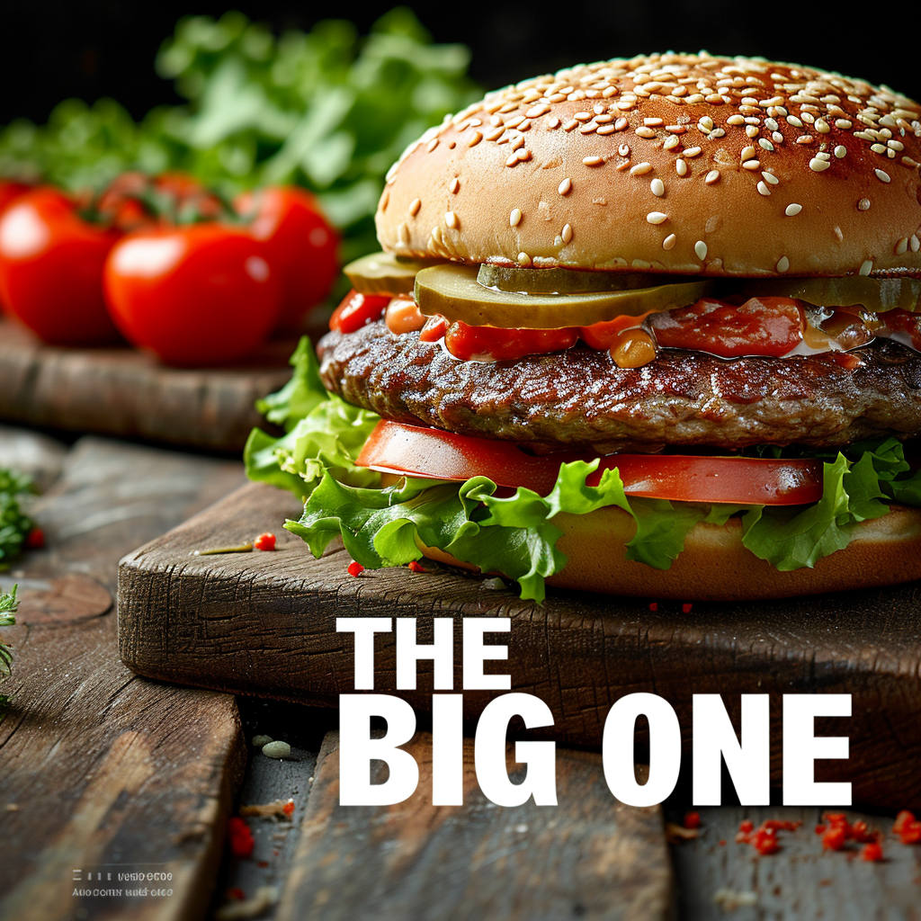
Using the style raw parameter can make text stand out more, but this is usually at the expense of the artistry of the image. You can compare the effects of turning the style raw parameter on and off to find the balance that best suits your needs.
The right side is without style raw, while the left side is with style raw.
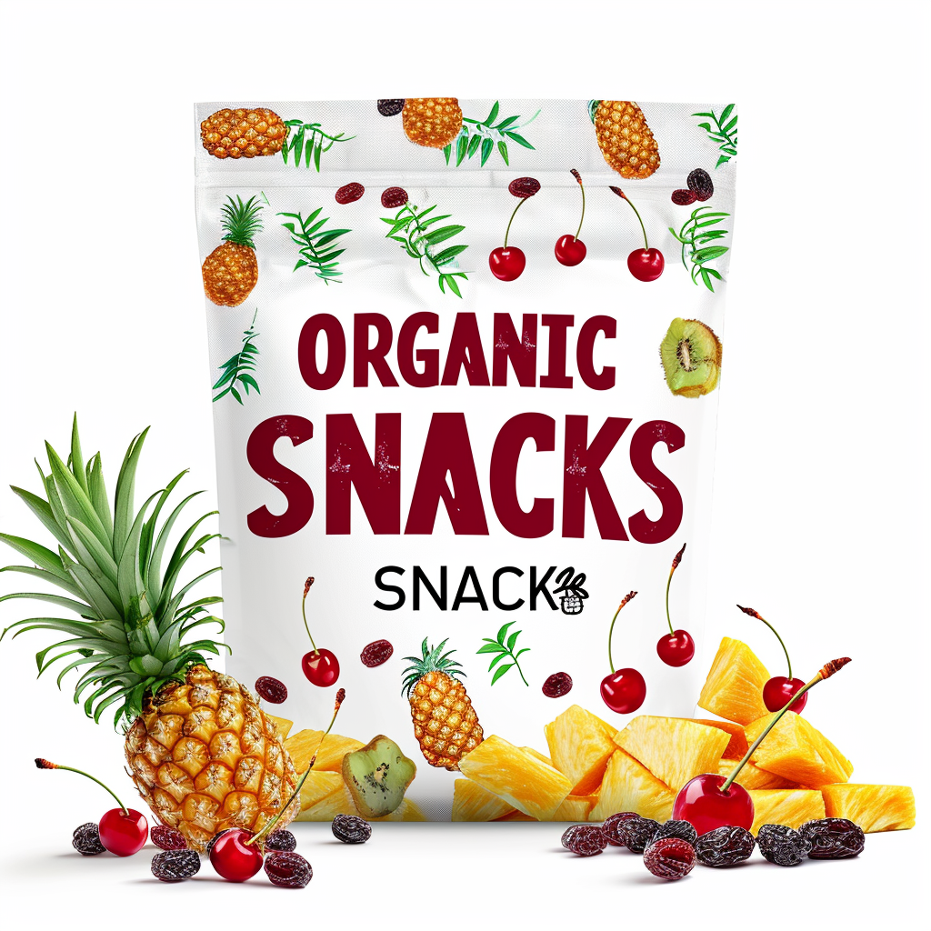
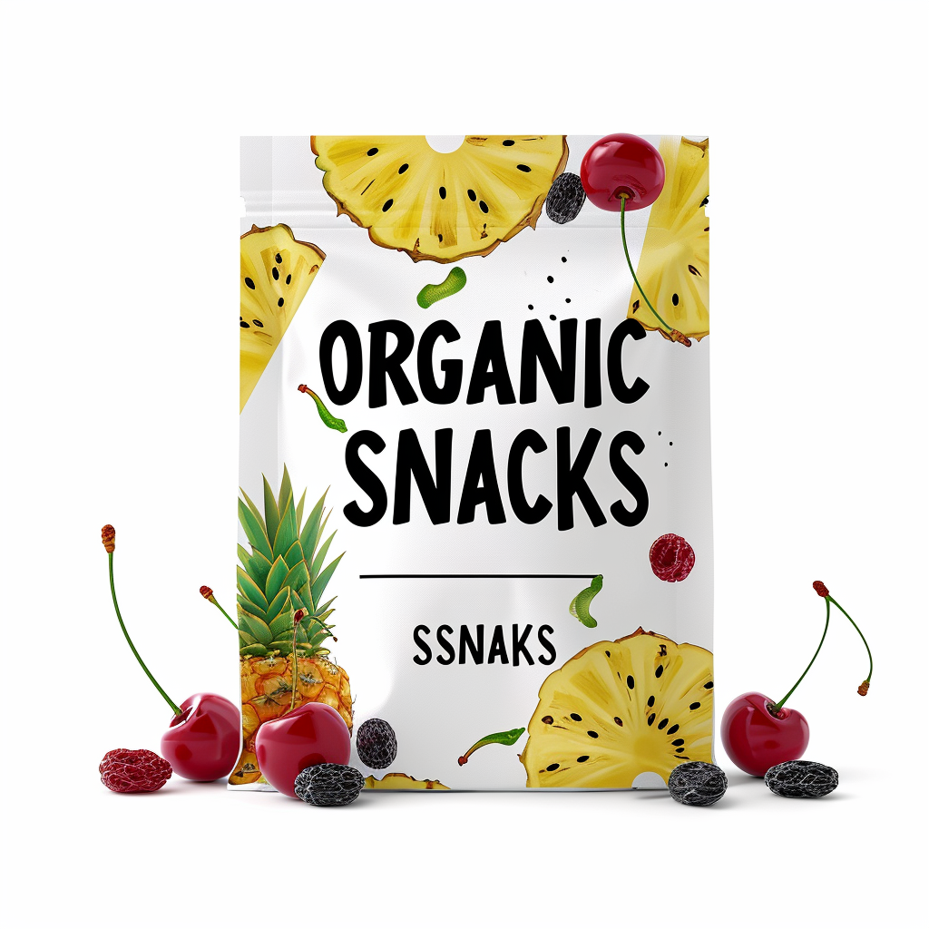
A lower stylize value makes the text larger and more accurate, while a higher value makes the text more refined (but possibly smaller). If the stylize value is set too high, the text may disappear into thin air.
The right side is --stylize 100, while the left side is --stylize 250.
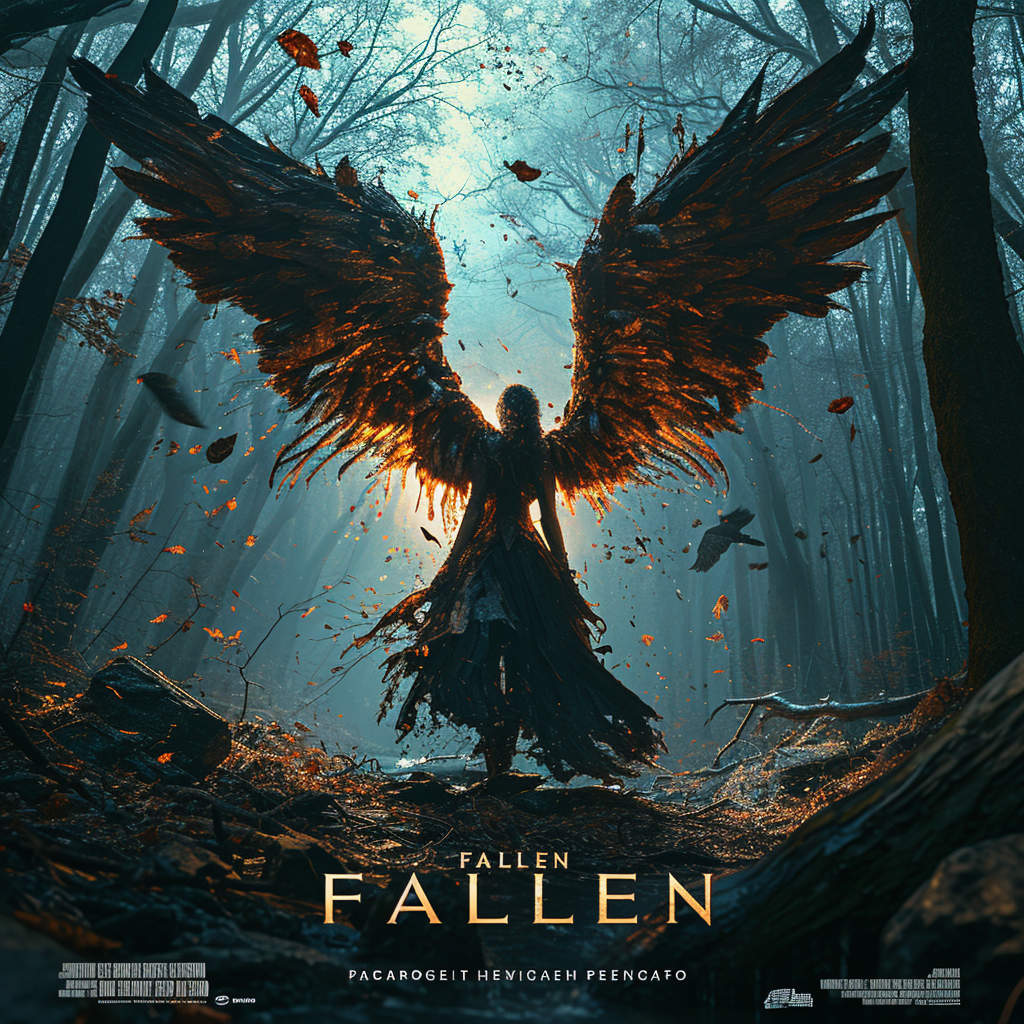
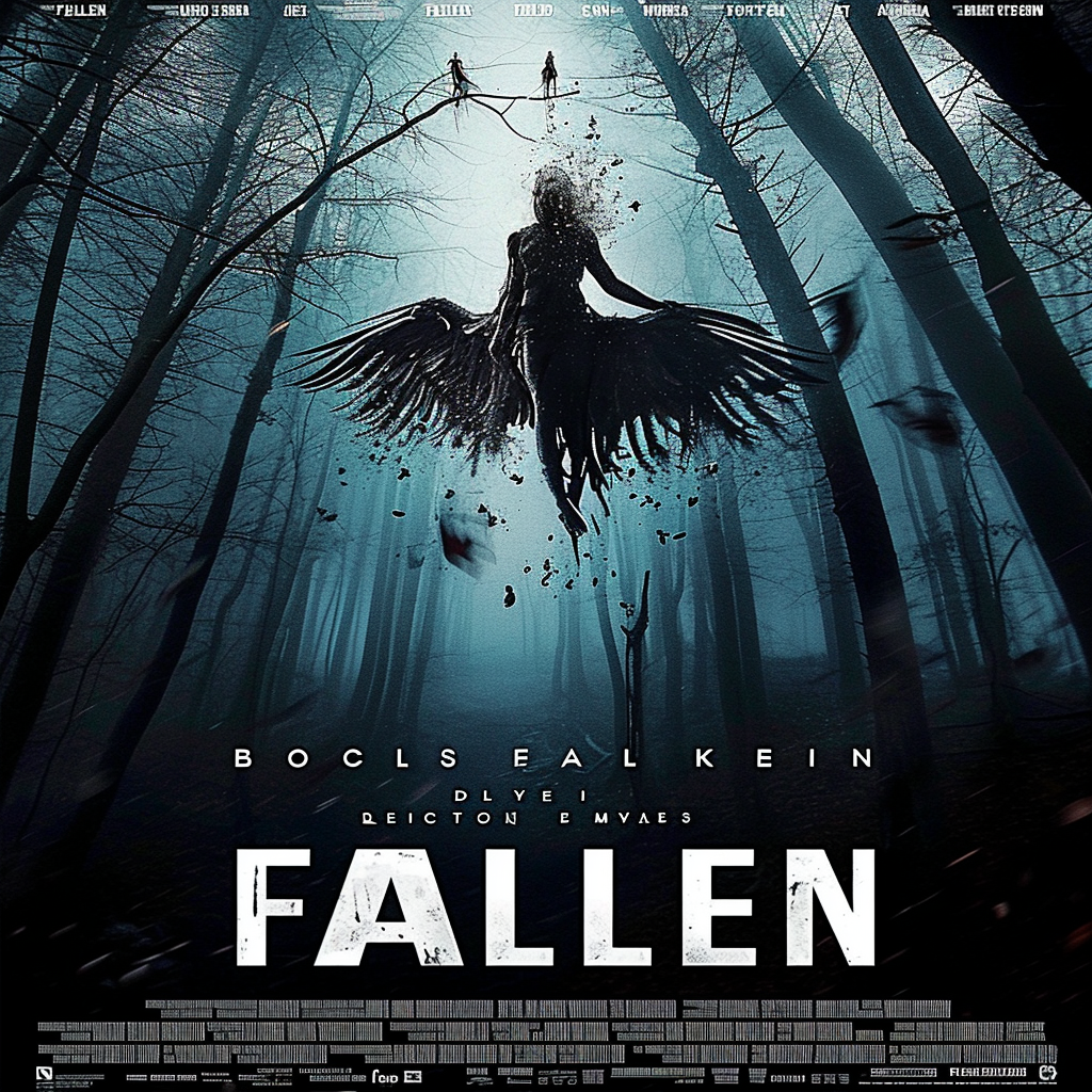
Try using Strong Variations on the original image. This way, you may get a better text effect in subsequent attempts.
On the right is the original image, while on the left is the effect after "Strong Variations".
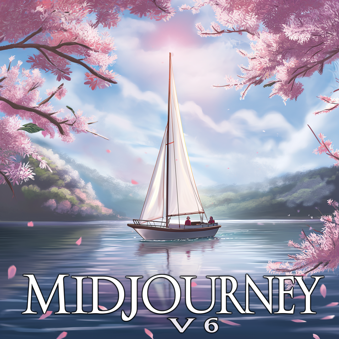
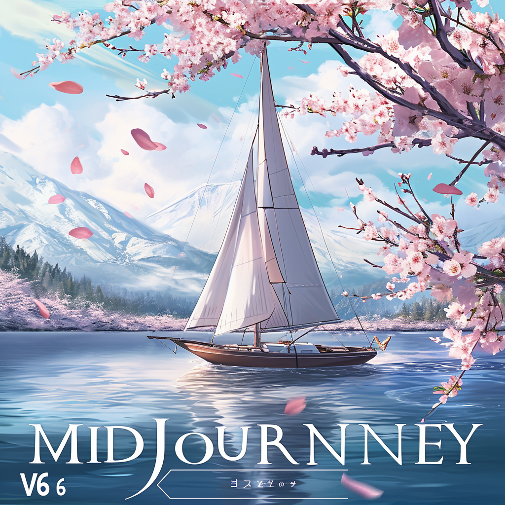
By using the Subtle or Creative amplifiers, you can dramatically improve the clarity of your text. Compare the results before and after amplification, and you'll see that your text is much sharper and clearer.
On the right is the original image, while on the left is the effect after "Subtle", you can click on the large picture to compare.

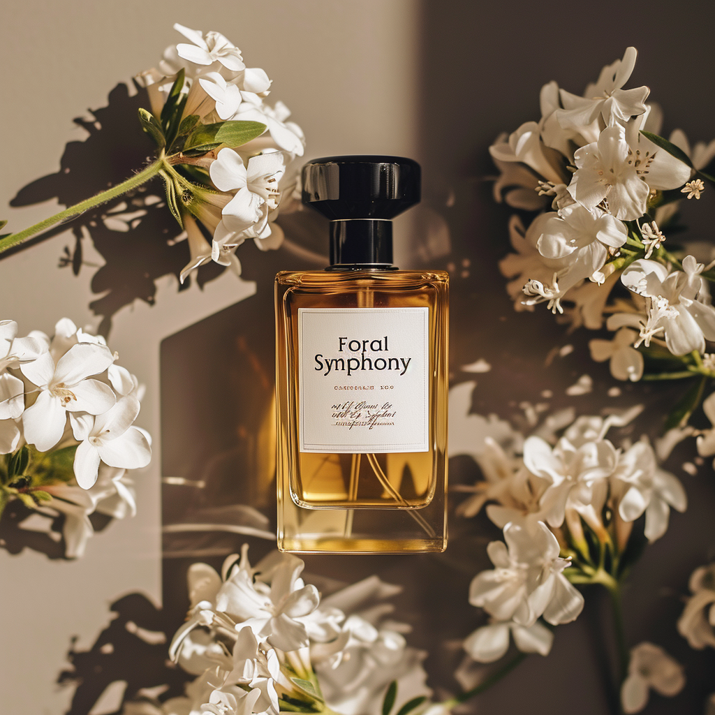
If you like the style of an image but are not happy with the text in it, you can use this image as an image tip for a new image.
In this way, you can successfully transfer favorite styles to a new image, while also potentially obtaining a more accurate text effect.
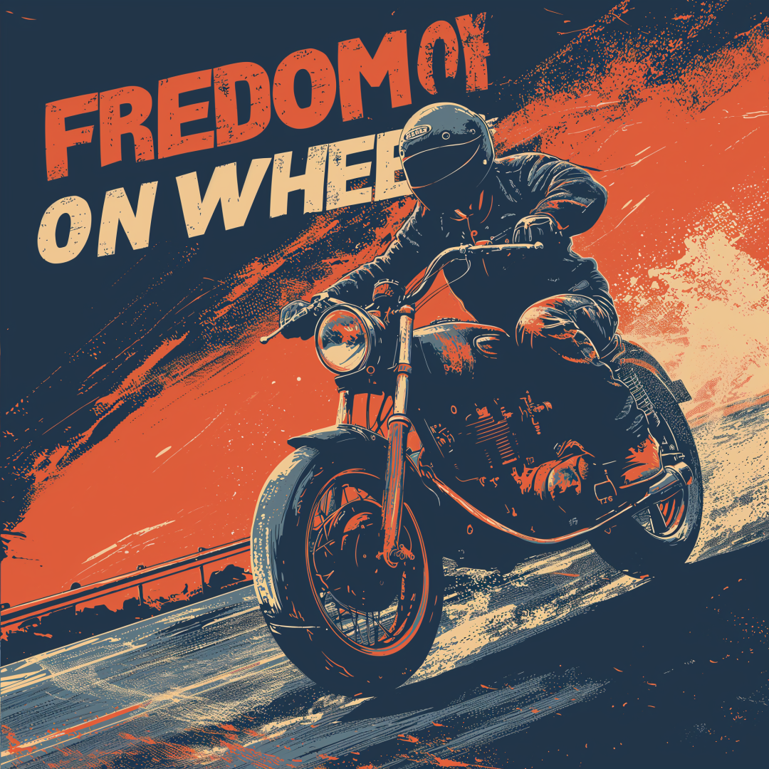
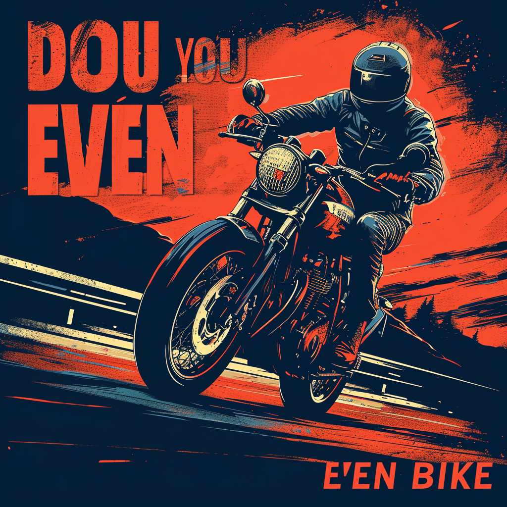
Not happy with the text on the right, keep the style to become the text on the left.
Hopefully these tips will help you get better at usingMidjourney v6 and create more amazing work.
